Understanding the Basics of Responsive Web Design: A Comprehensive Guide
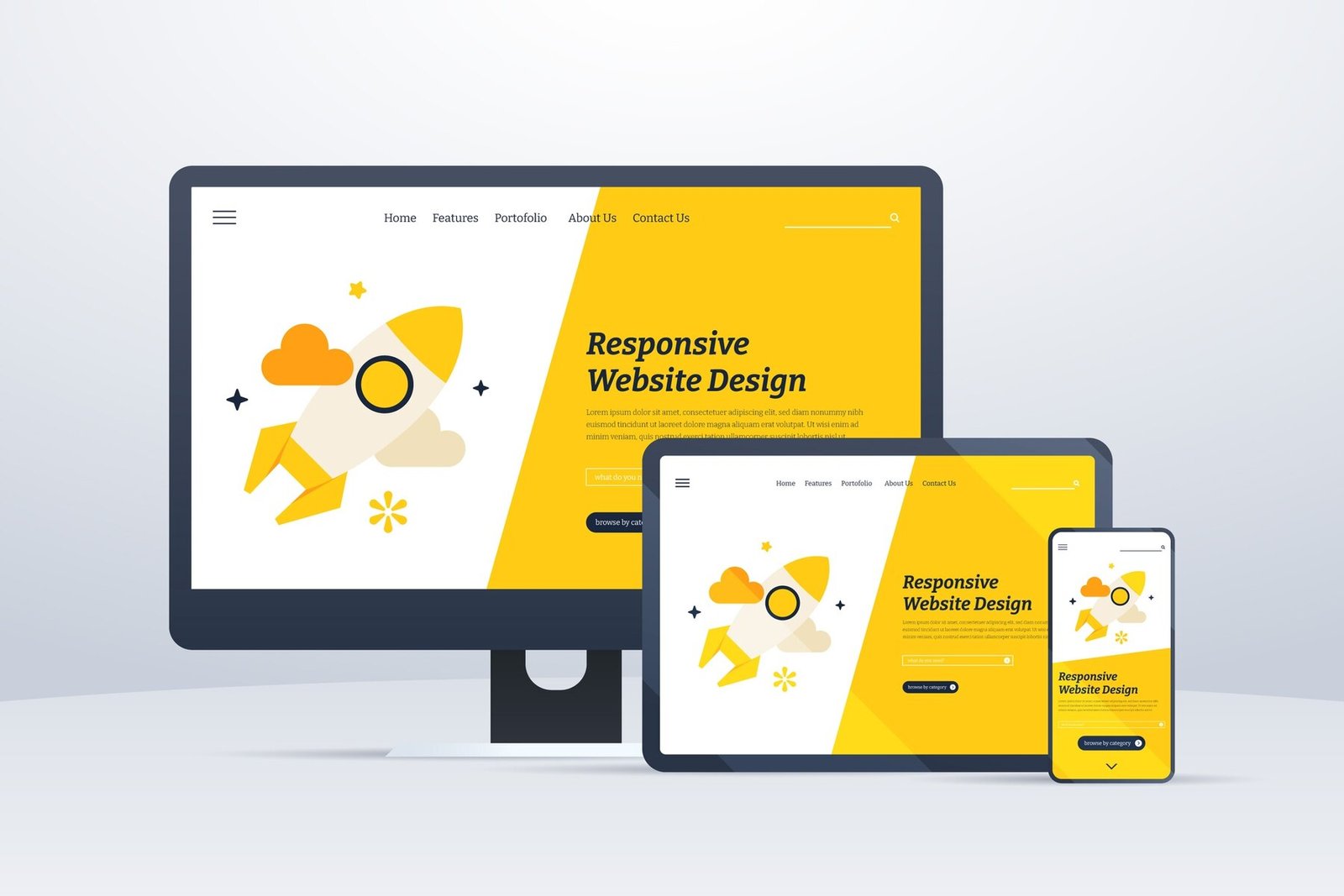
Responsive Web Design (RWD) is an approach to web design that makes web pages render well on a variety of devices and window or screen sizes. It uses a combination of flexible grids and layouts, images, and CSS media queries to ensure that users have a seamless browsing experience, regardless of the device they are using. The three core components of RWD include:
- Fluid Grids: These are grid systems that use relative units like percentages instead of fixed units like pixels to create a flexible layout that adapts to various screen sizes.
- Flexible Images: Images should be able to resize within their containing elements to prevent overflow and maintain the layout's integrity.
- Media Queries: CSS techniques that allow the application of different stylesheets based on device characteristics such as screen size and orientation.
Implementing responsive web design is essential in today’s digital landscape, where users access the internet through a multitude of devices such as smartphones, tablets, and desktops. This adaptability not only enhances user experience but also improves search engine rankings, as search engines like Google prioritize mobile-friendly sites. In order to ensure that your website is truly responsive, consider the following best practices:
- Test your website on multiple devices and screen sizes regularly.
- Use a responsive framework to simplify the design process.
- Optimize loading times by reducing image sizes and minimizing code.
Top 5 Principles of Playful Responsive Design
Playful responsive design is an innovative approach that invites users into a more engaging and interactive experience. The first principle is flexibility. This means that your website must adapt smoothly across various devices and screen sizes without losing its aesthetic appeal or usability. Utilizing fluid grids and responsive images ensures that content is not only accessible but also visually striking, allowing your brand's personality to shine through.
Another essential principle is delightful interactions. Implementing whimsical elements, such as animations or micro-interactions, can significantly enhance usability and make a lasting impression. These small design touches help create a memorable user journey, making visitors more likely to return. Lastly, remember that clarity should never be compromised in your playful design approach; even as you emphasize fun, keep navigation intuitive to maintain user satisfaction.
How to Create Engaging User Experiences Through Responsive Design?
Creating engaging user experiences through responsive design is essential in today's digital landscape. As mobile devices continue to dominate internet usage, ensuring that your website adapts seamlessly to various screen sizes is crucial. Implementing responsive design involves using flexible grids, layouts, and images, as well as CSS media queries to tailor the user interface to different viewports. This adaptability not only enhances usability but also improves aesthetic appeal, encouraging users to spend more time on your site.
To achieve an effective responsive design, consider the following strategies:
- Prioritize content: Ensure that your most important information is easily accessible regardless of the device being used.
- Test across devices: Regularly check your website on various screen sizes to identify any issues and optimize the layout.
- Optimize load times: Fast loading speeds are crucial for retaining users; compress images and minimize code to improve performance.